

MILWAUKEE
UNITED
FOOTBALL CLUB
Sports Branding & Kit Design
MILWAUKEE UNITED
FOOTBALL CLUB
Sports Branding & Kit Design
Milwaukee United was a speculative branding project developed in anticipation of a real minor league soccer club projected to launch in 2025. Working within a structured course framework with instructor and peer feedback, the challenge was to build a complete visual identity system from the ground up — one that could hold its own in the competitive, culture-driven world of soccer branding.
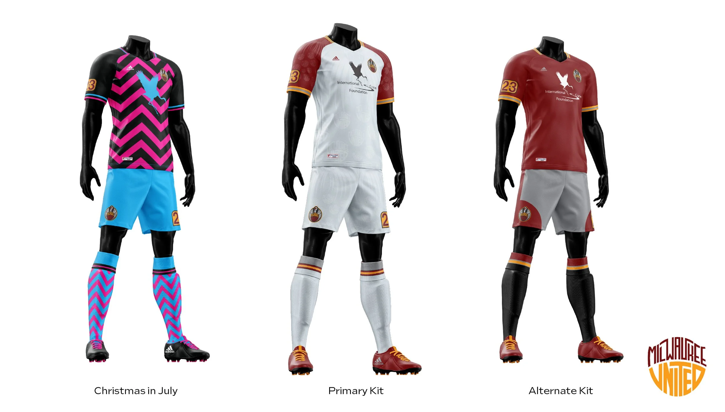
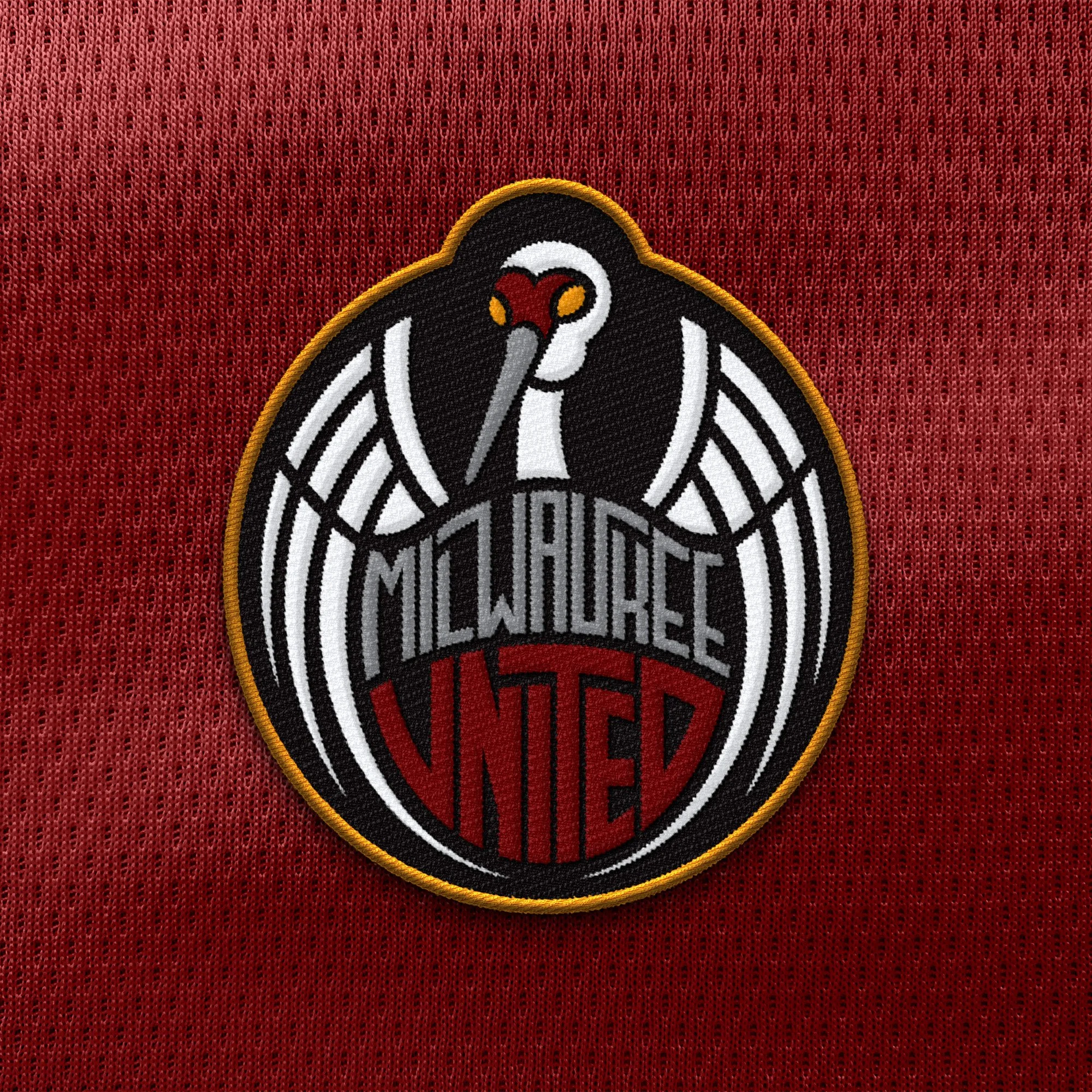
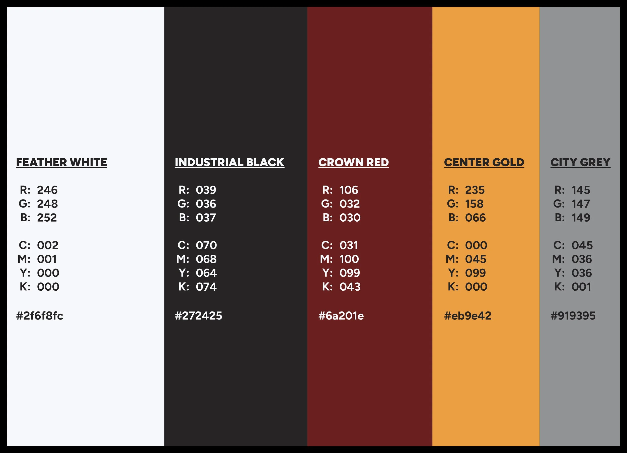
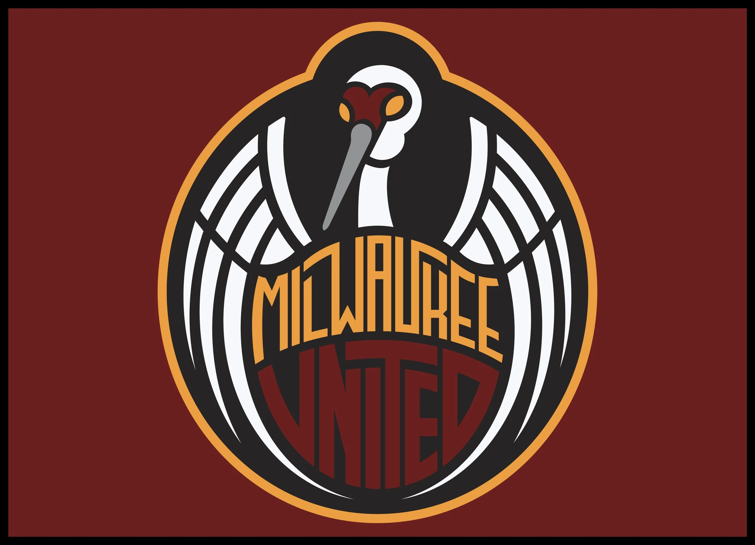
The identity is anchored by a circular crest featuring a Sandhill Crane — a bird deeply tied to Wisconsin's natural landscape and migratory tradition. Bold and commanding in silhouette, the crane brings a sense of regional pride and athletic power to the mark. A palette of charcoal, maroon, grey, and orange gives the system a distinctive edge that feels both modern and grounded in place. Custom lettering for the "UNITED" wordmark reinforces the hand-crafted energy of the overall system.
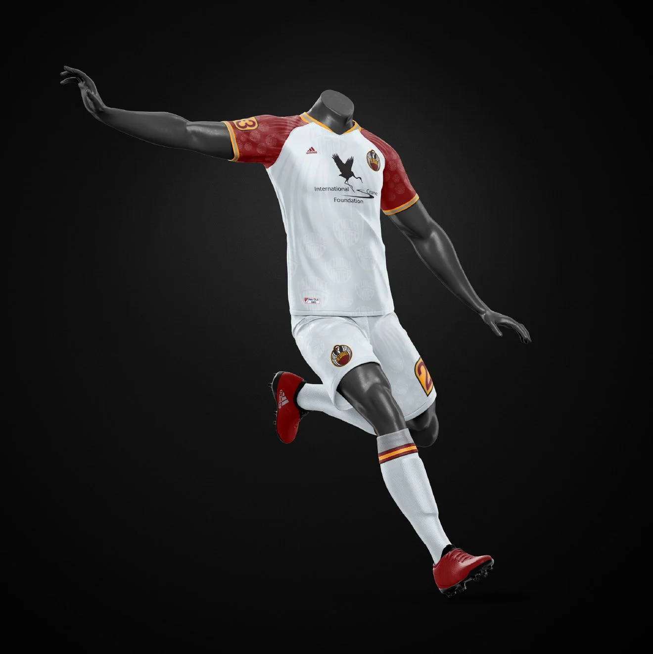
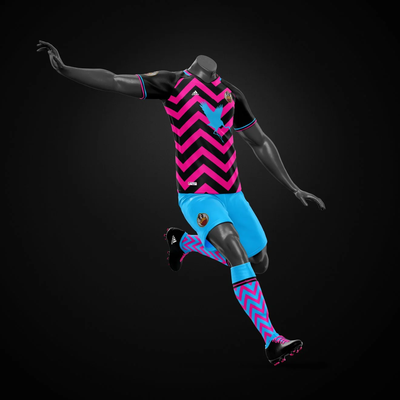
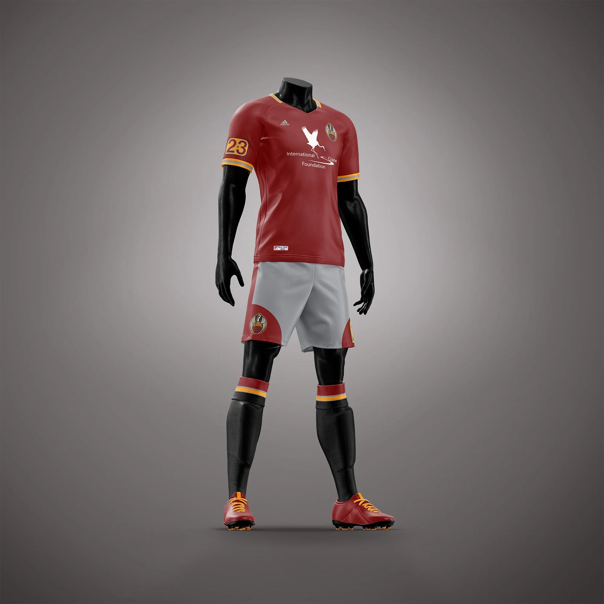
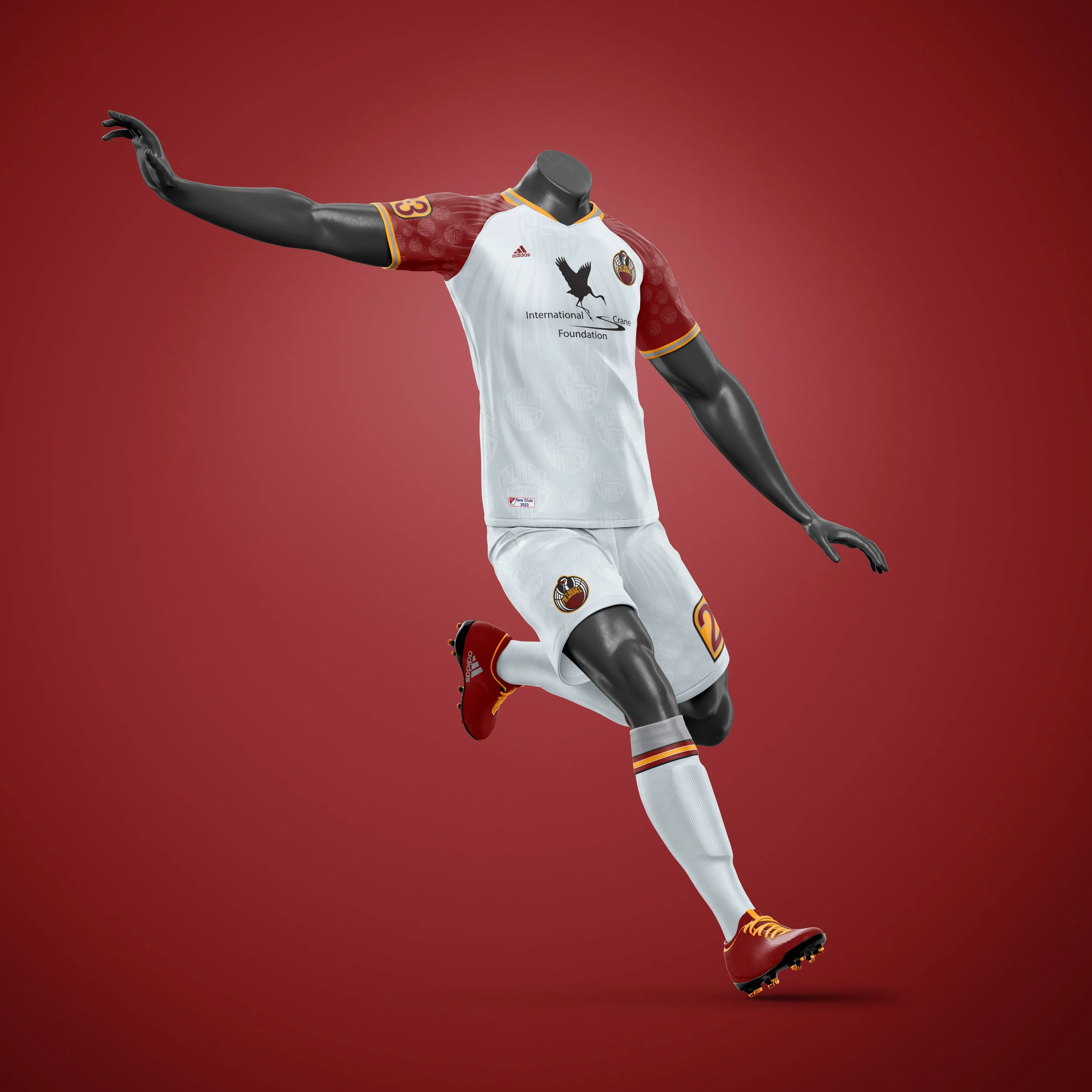
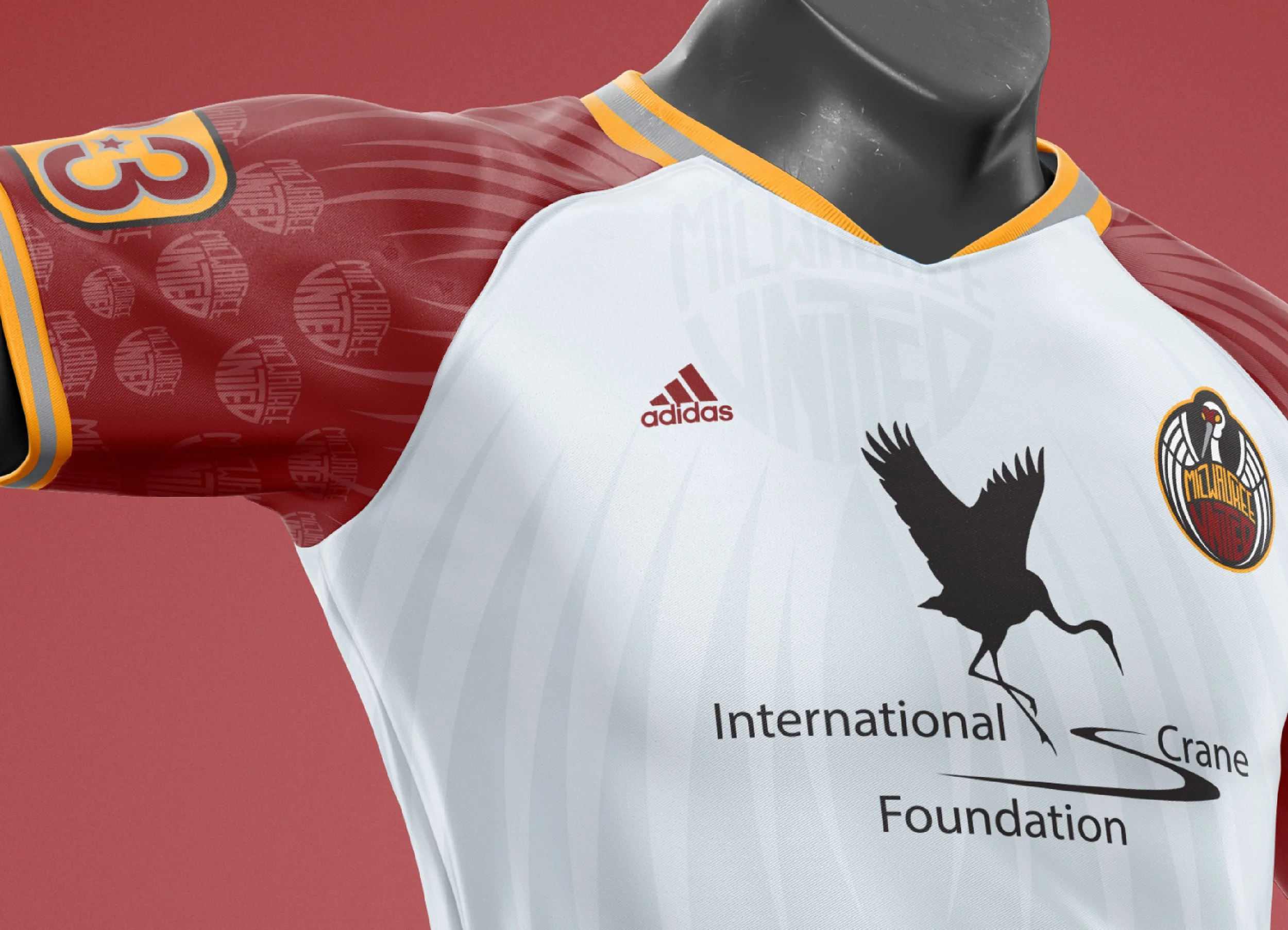
The kit system extends the identity across three distinct designs. The Primary Kit is clean and white, with maroon raglan sleeves carrying the crane silhouette and brand texture — built for legibility on the pitch. The Alternate Kit inverts the palette to a deep maroon with grey shorts, maintaining full brand consistency. The third kit — dubbed Christmas in July — takes a bold departure, pairing a black base with electric pink chevron patterns and sky blue shorts for a high-energy, culture-forward look that reflects the expressive side of modern soccer kit design.